2022 will be an explosive year of bright colors after two years of being turned down by the epidemic. Designers and many famous paint companies around the world have predicted that next year’s trend focused on antique style, warm, outstanding and impressive colors such as earthy yellow or deep pink. Let’s learn about these colors to decide on interior colors for 2022.
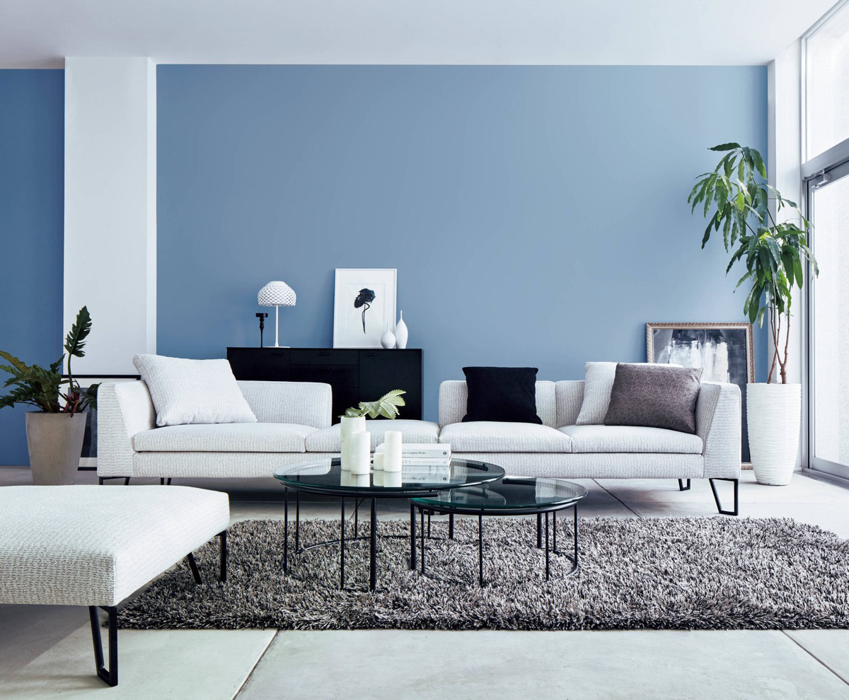
Peace with blue color
Next year’s interior color trend cannot omit blue. Forgetting the gloomy days, the blue color represents peace and safety and bring a sense of lightness, nurture optimistic emotions for the soul. This color gamut is also very easy to use, as it can be the perfect base for darker colors.
Dynamic with orange
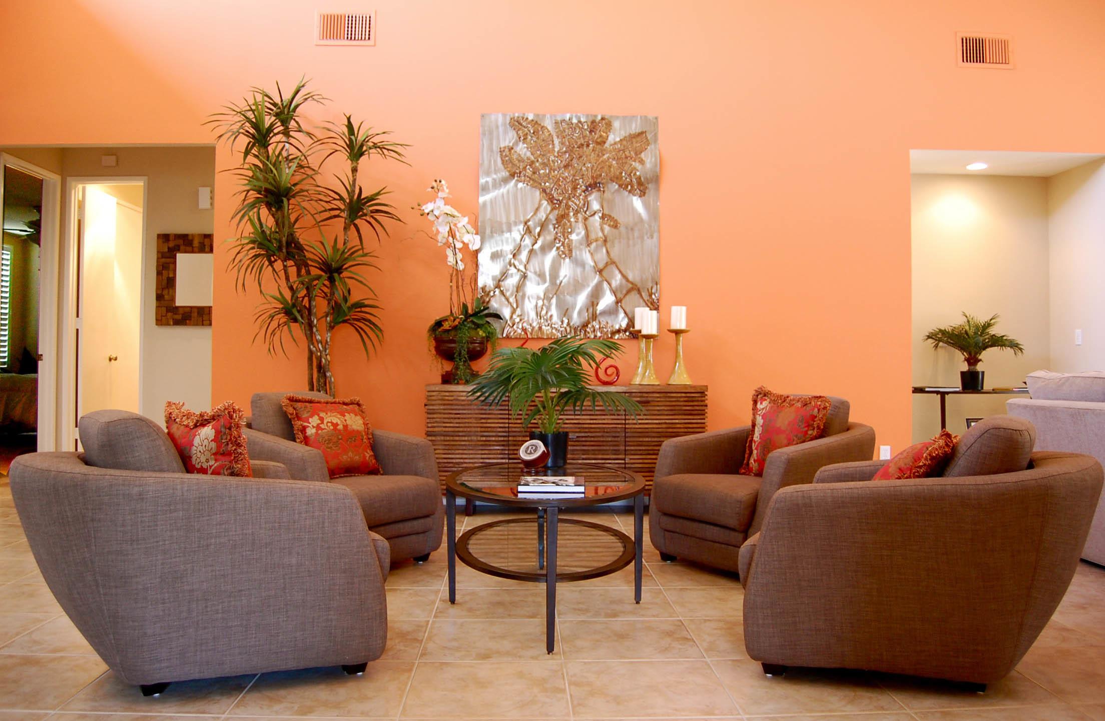
Orange symbolizes energy, bringing a bright and lively space. Different shades of orange evokes different feelings. For example, youthful and modern coral orange is suitable for living room furniture such as wall tiles, Retro earth orange shows the mixture of modern and classic.
Personality with light pink
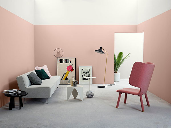
Pink is often misunderstood as a color with feminine shades, but pink represents strong personality. This color scheme will suit both classic and modern styles and be a perfect solution for wall color in 2022 because the color is not too bright, and it is also easier to coordinate furniture. A few pictures on the pink wall can make the space more sophisticated.
Neutral colors
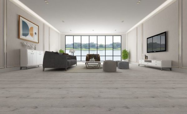
When it comes to neutrals, we tend to think of white, beige, gray or ivory tones. Neutral colors are easy to use because they can be combined with most other colors and give a feeling of calm and lightness.
AnPro regularly updates the latest color trends and applies these colors into our products to show the fashion through each collection. Wall panels, floorboards in neutral colors which are placed in any space are suitable and highlight the style of the owners when combined with other furniture.
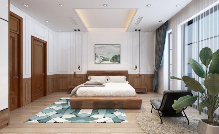
Another benefit of using neutral colors in the home space is to make the room more luxurious, generous, and spacious.
Some factors to consider when choosing interior colors
- Area of space: According to Charu Gandhi, founder and director of Elicyon, the size of the house will affect the color scheme. In large houses, color matching will be more simple because there is a loose color palette, but with small houses, this task becomes really challenging. Houses with a small area should only choose three colors that harmonize and form continuous color bands. A few suggestions for a three-color scheme like ivory white, with egg yolks with a little navy blue, accented with copper or metal. In addition, the 3-color pair of magenta, nude and orange tones also create a feeling of lightness but luxury. Another combination is the light purple of lilac, green of milk thistle and amber, bringing a pleasant feeling to the eye.
- Light in the room
- Hobbies


 Tiếng Việt